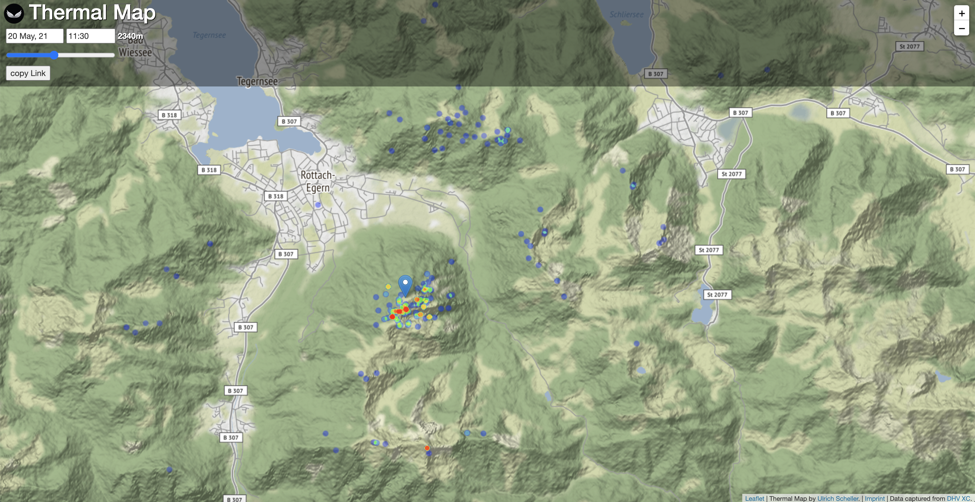
The Thermal Map shows individual thermals on a map extracted from real flights. They are filtered to only show relevant data for an individual flight situation.
Thermals are upward winds used by paragliding and hang gliding pilots to reach a higher altitude. Good thermals happen to be in similar places based on parameters like the time of the day, the day of the year, and others.
The map shows all relevant thermals for the given position and time as if a paraglider would be there. It answers questions like
- What is the earliest possible starting time at Grente?
- How high do I need to be before crossing the Inn river and where to find the next spot?
- What is the best route back from Saalfelden in the late afternoon?
- When and where to expect the last thermals of a day?
Figuring out the answers to this kind of question was possible before. It just took a lot more time and/or tries. I hope that with this information at hand, many pilots can improve faster and have longer and better flights.
Usage
The Pin symbolizes a paraglider at the current location. You can drag and drop it to move around. The current date, time, and height can be entered with the controls on top. When you refresh, a random typical takeoff situation is shown.
You can use the arrow keys to change the height and the hours of a day. UP/DOWN will add/remove 100 meters to the current height. LEFT/RIGHT will subtract/add an hour from/to the current time.
Lu-Glidz has written a good (german) description of the thermal map and how to use it.
Details
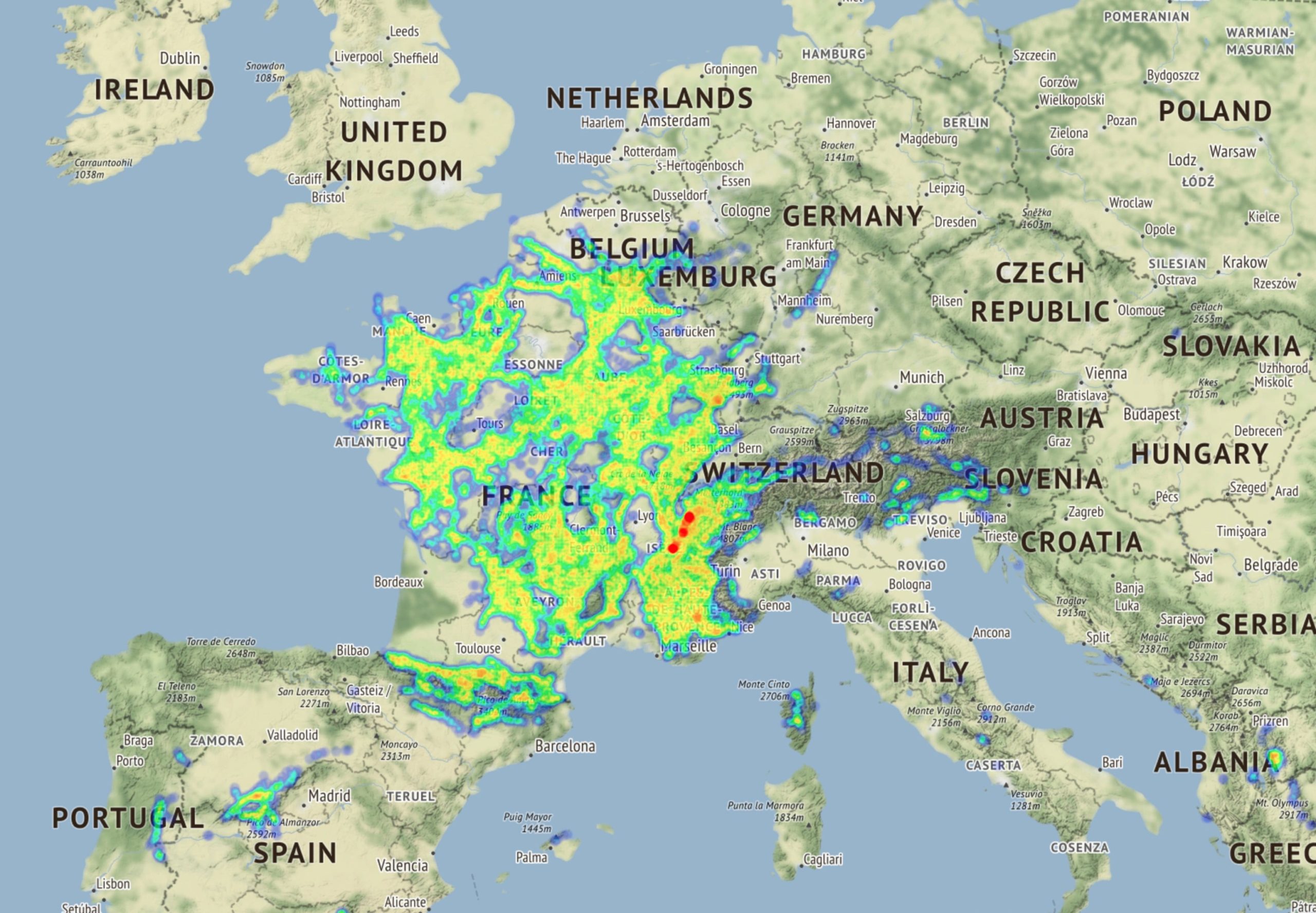
For the map, more than seven million thermals were extracted from over a million flights. They are filtered based on a given time and date. The selected year is ignored.
Another important aspect is the current height. Only thermals that can be reached are shown. This is calculated by checking if the distance to the known thermal entry position can be reached from the current position and height.
Contrary to that, some thermals have such a low exit altitude that they can not improve the current position. You are able to fly over the top of these thermals. Those points are also excluded. You can see this by setting a very high altitude value. Closer thermal points will disappear.
From the given time, a time window is calculated with 60 minutes around. However, for being able to see the earliest and latest thermals, the window is sliding based on what time it is. So, for 9:00 the 60 minutes are from 8:00 to 9:00 but for 21:00, the window goes from 21:00 to 22:00. There is a similar window of 30 days around the current date. However, the specific numbers are subject to change.
To distinguish good thermals from not so good, the points are color-coded. Red indicates a high potential climb while blue stands for less vertical gain. When zooming out, multiple points are combined and the area turns red as well.
FAQ
Can I use the map while flying?
Yes, this is possible by using the following URL: https://thermik.pumpt.net/?live=true&zoom=11
Here is a blog post describing how to set it up.
Personally, I show the map as a website widget in XCTrack. It requires donating for a Pro version. Other ways might be possible, for example using the browser.
Why do thermal points move a little when slightly changing height or position?
Because the entry point into a thermal changes. Thermals often do not move straight up but are affected by the wind. Therefore, when reaching the thermal close to the bottom, you have a different entry point than when reaching it close to the top.
Where does it work best and where are the results less good?
The map works best in places with lots of flights and where there are well-defined thermal trigger points. This is the case in alpine regions and for example the Bayerischer Wald.
The Flatlands have fewer flights and thermals are less stationery. They tend to move with the wind and it is harder to identify typical trigger points there.
Changelog
08.07.2021
The Thermal Map can be used while flying.
Further performance improvements and reduced memory usage for caching.
Continuous updates from DHV website to always have the latest flights and thermals available.
02.05.2021
Significantly improved performance by LRU caching of database responses. The first database request still takes as long as before, but the time is near-instant when cached. The majority of requests are now handled by the cache.
In addition, the fine-grained calculation of relevant thermals was sped up by reordering the kick out-criteria. More thermals are excluded earlier in the calculation.
When the data is available in the cache, these changes improve performance by around a factor of 10.
01.05.2021
Database update with latest flights from DHV.
27.03.2021
Added option to change the height with the Arrow UP/DOWN keys on a keyboard. Arrow LEFT/RIGHT can be used for stepping through the time of a day.
![]()
15.03.2021
Switched from AWS Lightsail to t4g.micro EC2 instance for hosting the webserver and database. It has access to two AWS Graviton2 CPU cores and is significantly faster than the old x86 single-core instance.

13.02.2021
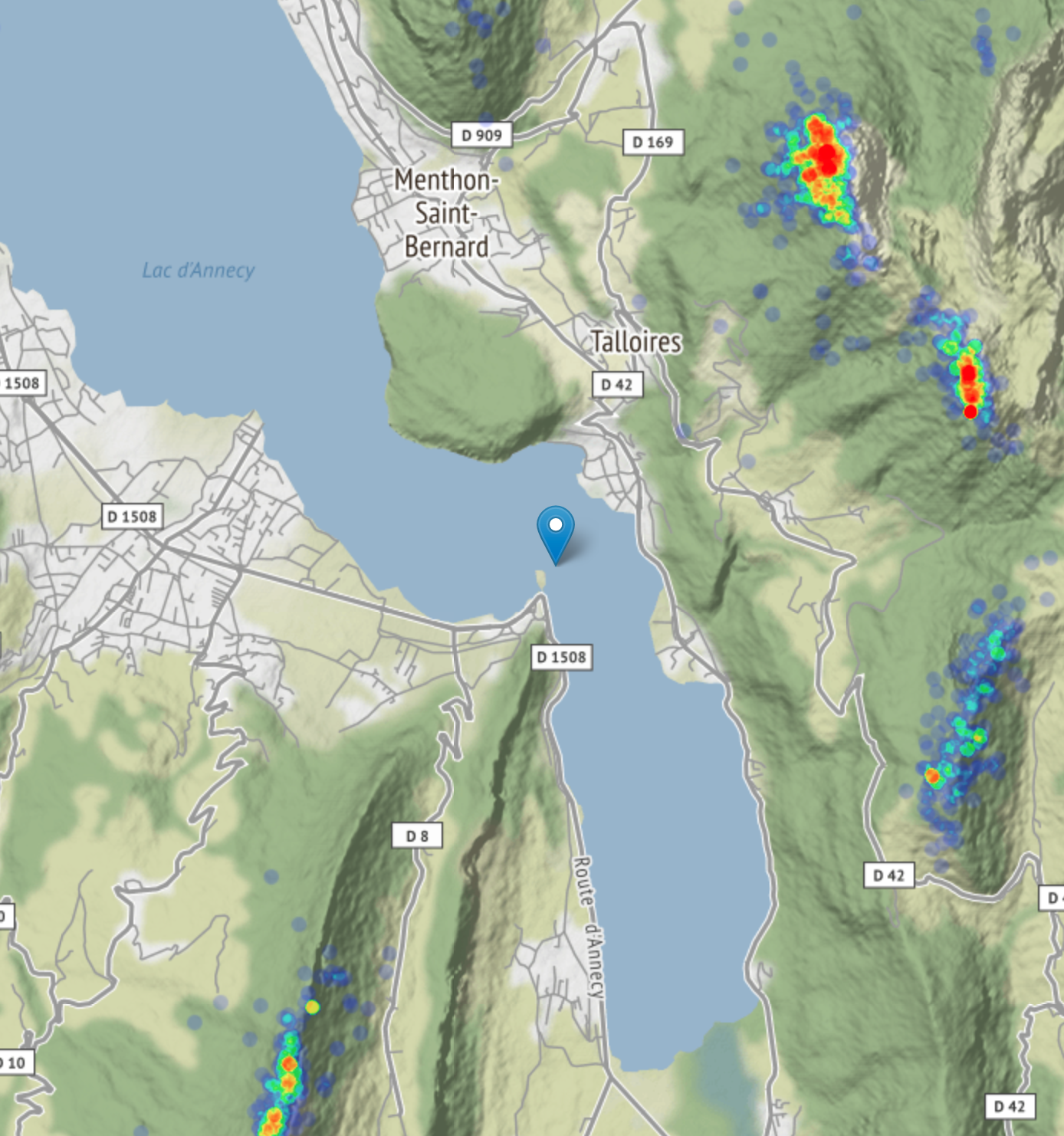
Updated database with 39 GB of flights from https://parapente.ffvl.fr/ for better coverage of France. The flights are from all around France and stretch into Switzerland and Spain:
-
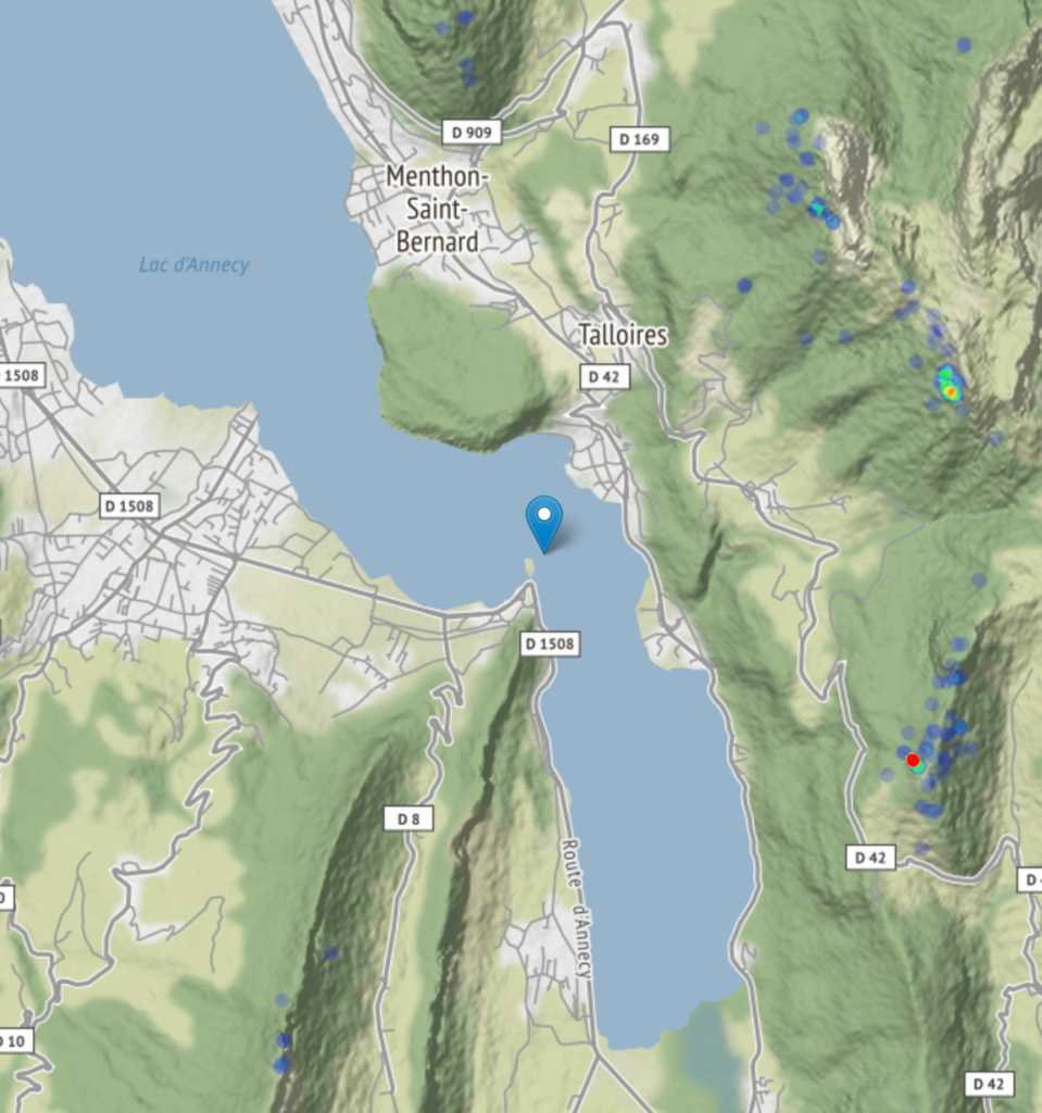
Lac d’Annecy before the update -
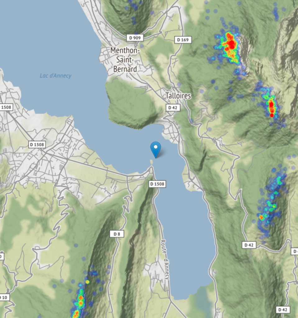
And after the update

Hello Ulrich,
Unfortunately I couldn’t find in your description or in that of Lucian whether the time information refers to UTC or LocalTime.
Best regards and thank you very much for this great tool!
Michael
Sorry, I missed your comment between a huge amount of spam. The time on the website is local time. You can recognize it when moving to exotic places like Roldanillo.
Servus Ulrich,
danke Dir für dein Time-Invest. Die Seite ist leider aktuell down:
https://thermik.pumpt.net/
LG
Christian