Paragliding data gems
Paragliding is my beloved hobby and besides offering stunning views and perfect days outside, it also provides a huge amount of flight data to process and play around with. Sites like xc.dhv.de, XContest contain millions of flights from thousands of pilots. These documented flights are gems of data waiting to be investigated by algorithms.
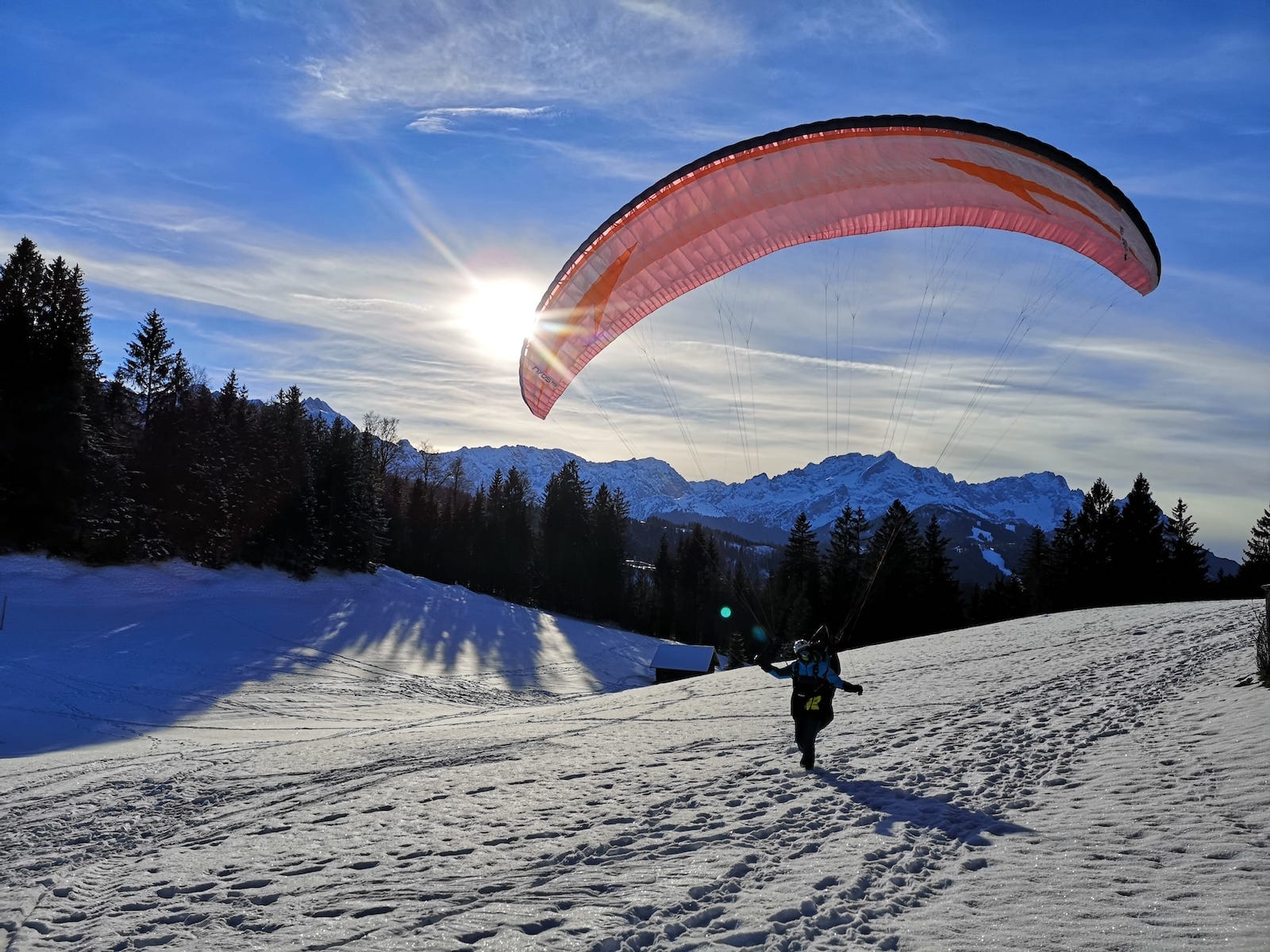
Outsiders to this sport tend to believe it is about getting up a mountain and simply glide down from there. This might be true for the first few flights, but it can be so much more than that. People stay in the air for up to 12 hours and cover distances of over 500 km. This is possible for the same reason birds can fly such long distances despite the tiny supply of energy they have in their bodies. It is the thermal activity of the air mass.
We all know the sideway wind on the ground. But the vertical winds can be just as strong as a horizontal breeze. And the upward winds are used for climbing as high as possible (and safe) and then glide to the next thermal.
Many books have been written about which factors are important for upward winds and where/when you can expect them to be optimal. But with lots of flight data at hand, it should be possible to see this by example. They just have to be processed and visualized in the right way. This is what Dr. Maximilian Koch and I worked on over the lockdown period.
Get the data
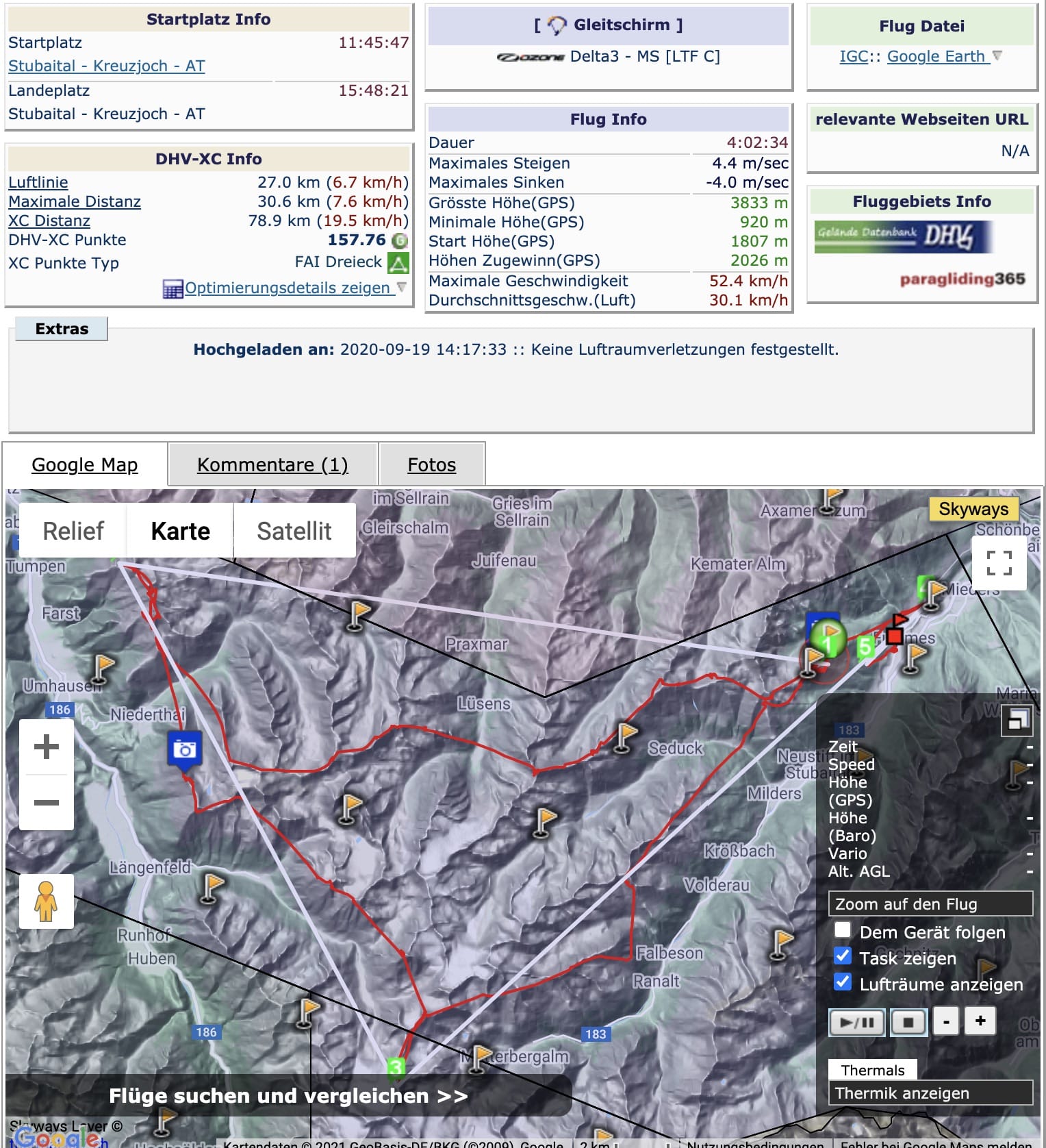
We started with simple scripts for downloading flight data, including all the geo coordinates. For now, it operates on a limited data set because scraping more than a million flights takes time and the process needs to be evaluated first. We don’t want to spider everything and then figure out that something is missing or handled incorrectly. The following examples are based on ~36.000 flights, with a paraglider or a hang glider.
All the data is processed at first for extracting basic information like the takeoff site, the date, and the pilot’s name. In a second step, all the geo-coordinates are processed for thermal activity. I am using this igc-lib for parsing the flights. Judging from some examples, it is not perfect but works well enough on big data sets.
It evaluates the geo-coordinates and extracts thermals and glides from the flights. This information is stored in a local database. Each thermal contains information about the start and end time, the height at both times, the vertical velocity, etc.
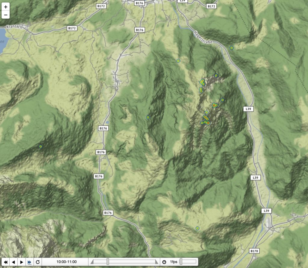
Thermal heatmap
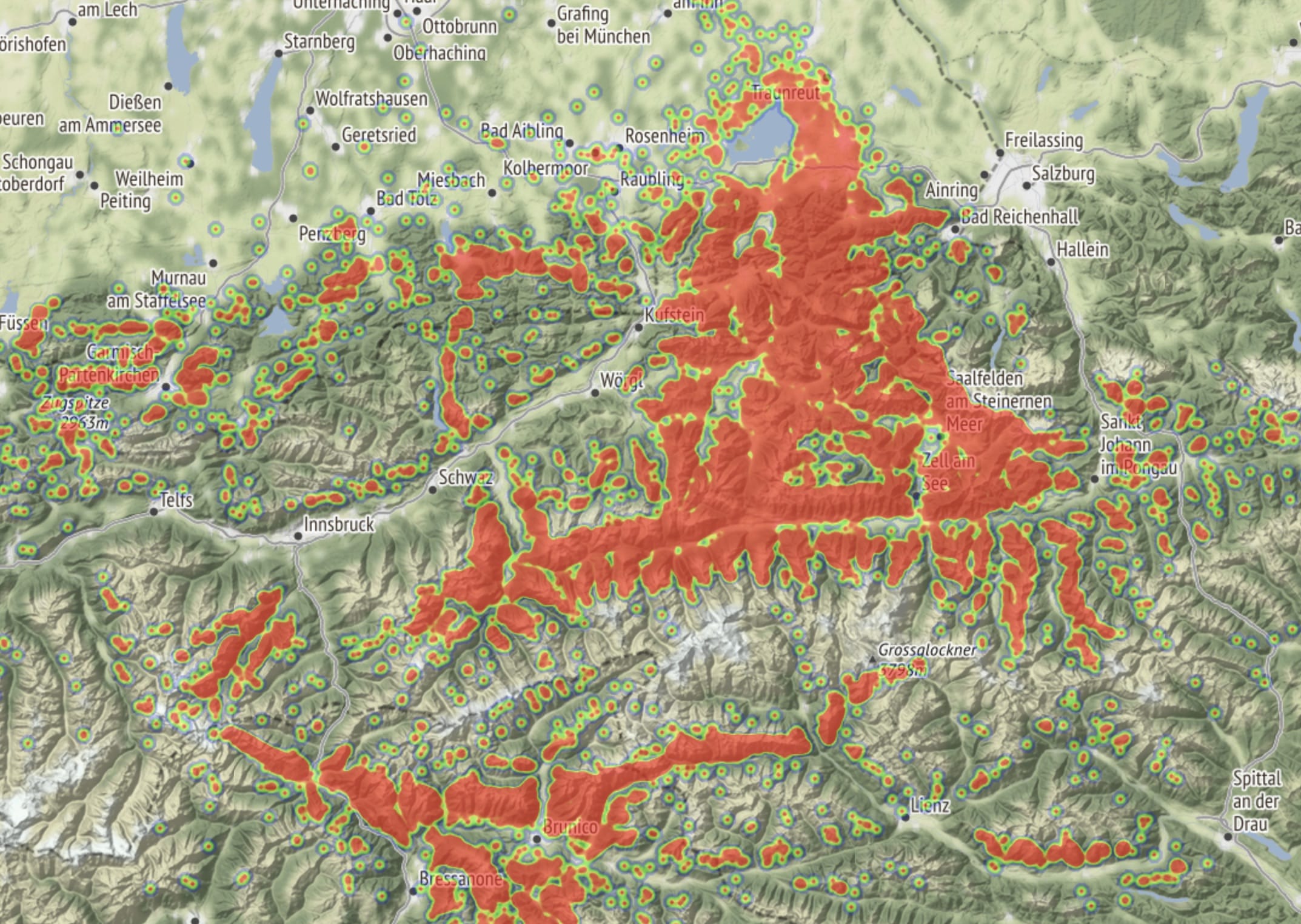
What can we use that data for? An obvious use case is to show all the thermals on a map, as in the image above. You can see the typical flying routes marked in red. Areas with lots of data appear completely colored, but this is only because the zoom level is so high.
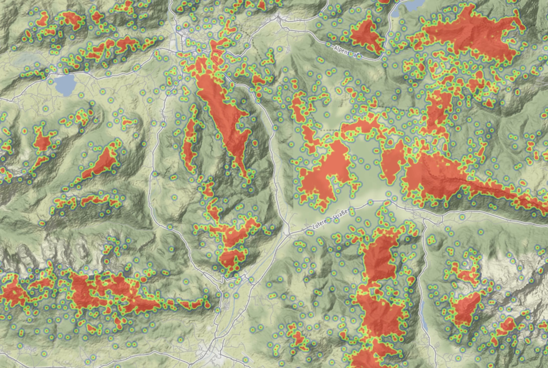
When zooming in further, we can see in more detail where to expect upward winds. As the theory states, it is mostly above the peaks and ridges. So far this is similar to other work in the same direction. For example, the paragliding maps show a similar pattern.
Our basic heatmap can be seen and navigated here.
Time based activity
One factor that changes thermal activity is the time of the day. Depending on the sunlight, different areas of the ground are heated and generate a warm airflow.
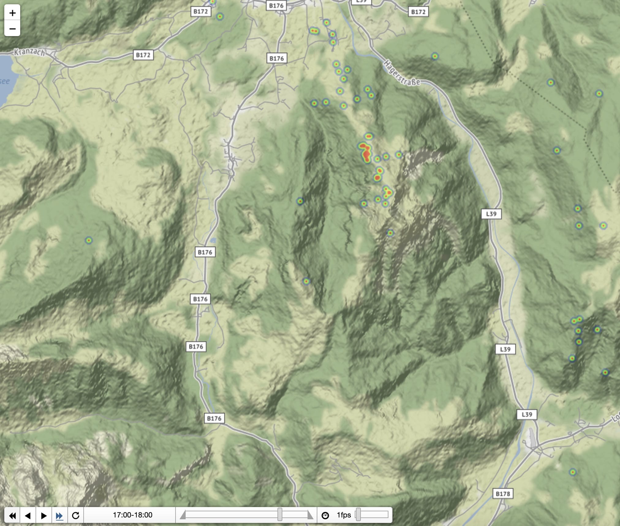
Therefore, it is interesting to see how thermal activity changes during the day. Here is a time based heatmap in which you can step through all thermals of the day on an hourly base.
The hourly information can be useful to see when and where it is possible to launch in the morning. For long-distance flights, you need to start as early as possible and gain height.
As mentioned before, the data is not complete and it will always have a bias. There are certain areas and routes which pilots typically take. When stepping through the hours, these routes are made visible. Those routes are often used because they are the best possible options. Therefore, even the limited data set is useful for flight planning as they show the most relevant information on the map.
Fun facts
In this dataset of ~36.000 flights, the strongest thermals from start to end have an average climb rate of 7 m/s. There are some outliers showing more than 10 m/s, but all of them can be explained by hardware issues at the start of a flight. These 7 m/s are an average for the whole time of climbing, so there were seconds of a stronger climb as well.
The maximum height gain is 2282 m to an exit height of over 4100 m. This height was reached with an uplift of just below 2 m/s. Within the 36.000 flights, more than 200.000 thermals with a height gain of at least 100 m are reported. So there is an average of 5,5 such thermals per flight. The number is probably much higher in summer than in winter.
Next steps
The data set is still very limited as mentioned a few times. So one goal is to improve the data and download more flights from the respective sites.
There are other interesting questions to ask and possibly answer:
- Can we calculate the wind conditions out of the tracks?
- How does it affect thermal activity?
- Is there something interesting to see in the glides? Can we figure out the best gliding routes, maybe based on other factors?
- Is it possible to make the data more relevant during a flight? For example, a pilot would only be interested in thermal data that can make him reach a higher position. At the same time, only thermals that can be reached from the current position are of interest.
Can you think of more interesting questions that might be answered by that data? Send me an email and if it is easily possible, I can have a look into it.