As a native apps developer since 2008, I have seen time and time again the wish to develop everything with one toolset. Most often, the toolset of choice is the web, or HTML, CSS and JavaScript. In all cases I have experienced, this was a wrong move and users never liked the web app. Therefore, I say that native apps are superior to what a web app can achieve for most mobile use-cases.
Web vs. Native
However, that does not mean the web technology is a bad platform. It was just designed for different devices and use cases. For example, it is incredibly easy to show rich documents with web technology. This would be a hard task in native development and quite often a web view is embedded into native for that reason. Over the last decade(s), many great use cases have been enabled in web technology that were unthinkable a few years ago. Think of Google Maps, Live chats on websites, Youtube, 3D-Content, etc…
But there are important mobile aspects where the web still fails to deliver. First and foremost there is no layout mechanism that matches Androids way of developing for multiple screens. Unlike on a desktop, where pixel density has been relatively stable for a decade, on mobile devices it can be completely different. A normal phone screen might have a resolution of more than full-HD, while a 10″ tablet still has a HD-ready resolution. A single pixel is much much smaller on the phone than on the tablet. If you are designing your website with pixel sizes, your graphics might have the right size on either of them, but not on the other.
The normal solution in the web world is to use percentages of the screen size instead of hard coded pixels. This solves the problem above, but introduces a new one. What is the right image to show if it stretches to some percentage of the screen? It should be big enough to use the great phone screen, but not bigger than necessary to save bandwidth and keep page loading times low.
A related problem is to size a button correctly. You want to have the size of a button approximately match the size of a fingertip, so it can be pressed easily without taking too much screen space. This works neither with pixels, nor with percentages of a screen.
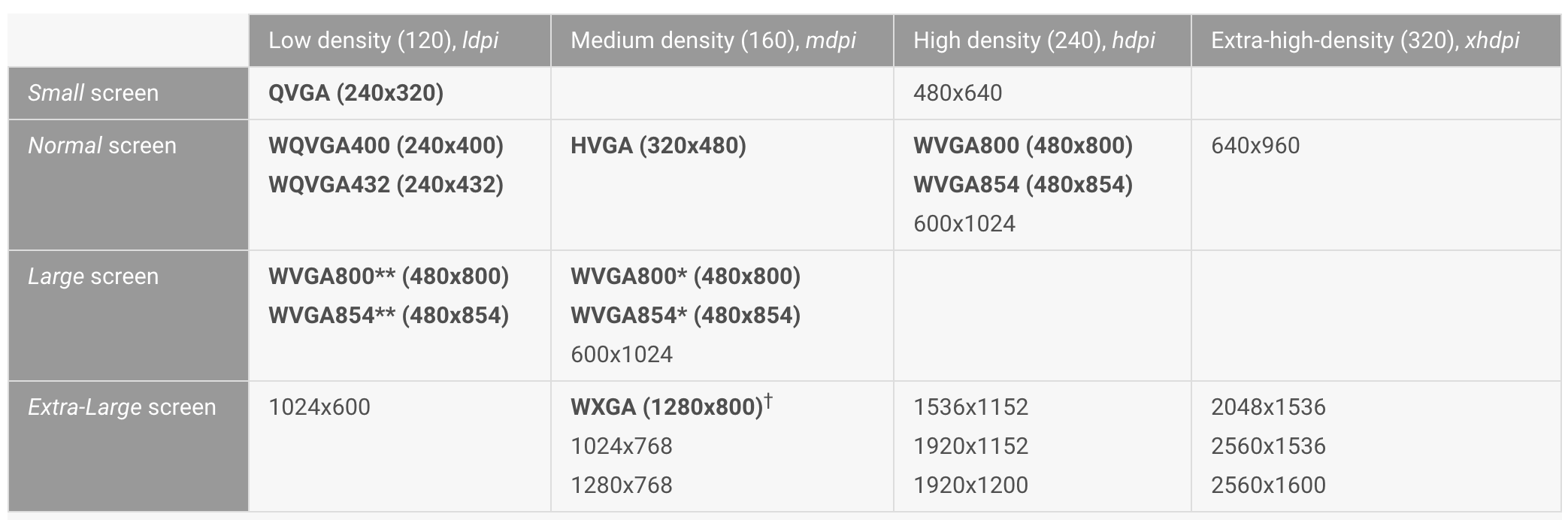
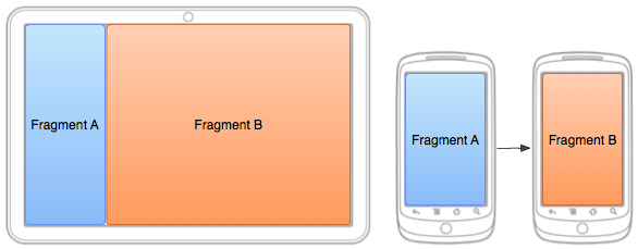
If we want to solve this problem, we first have to understand that this is not a one-dimensional problem. Size is not the only parameter we have. A users device can be on any position in these two dimensions: [small – large] X [low dpi – high dpi]. Android uses resource folders for both dimensions, where each device chooses its correct format. There is an explanation in the designing for multiple screens documentation.
Another thing is integration into the system. How do you create an Intent? How do you set an alarm? What about receiving Push Messages? If your app doesn’t need these features that is fine. But working around the limitations of a web container with native bridges enforces you to maintain both native for several platforms and web content.
And finally the promise of “develop once, it works everywhere” is simply not true for web technology. Different browsers behave differently and websites are cluttered with special case handling for certain clients. You still have to test and maintain how your web app looks on iPhone, iPad, several Android phones, browsers and other platforms you care about. And I am not yet talking about a platform-specific look and feel.
The right tool for the job
However, there are certainly cases when a web application makes a lot of sense. If you are mainly mirroring website content, it probably is a good idea to reuse much of your existing website. Even I, as a strong native promoter, have chosen to develop a web application in my last project.
The project was about using a tablet for controlling hardware, in this case to control several lights and display videos in a car prototype. Besides the pain points explained above a web application has its own strengths like being available without installing.
Another reason for not using a native approach was the server part. If there is a (web) server anyways, it can as well serve web content instead of just data and instructions. A native app would require one more layer on top of everything.
Most drawbacks mentioned above don’t apply for this case. The system includes one specific set of tablets, so it doesn’t have to adapt to multiple screens. The simple layout does not depend much on resolution and dpi, because most of it is text and vector content. The only image used is the background. And there is no system integration necessary.
Not just a boring website
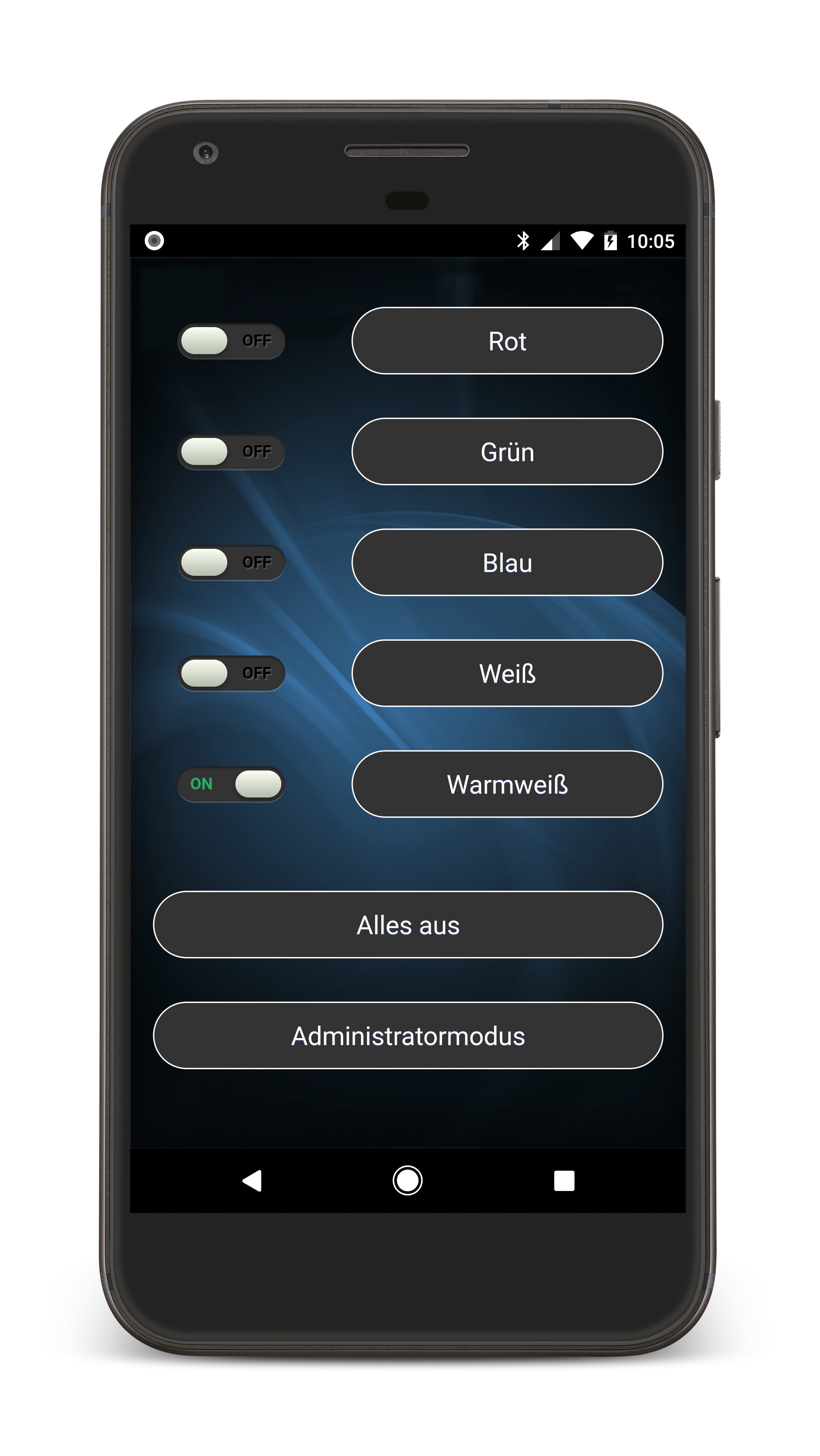
Above is a simplified version of the app, that I use for development. It is connected to a 4-channel LED (red, green, blue, white) to generate different colors. With the Administratormodus, you can modify color values of each channel.
To make it feel more like a native app, it has a homescreen button and no url bar on top. The application uses the whole available screen, except for the notification bar and the navigation buttons. It also features a splash screen while loading. This is easy to achieve, but goes a long way in making your web app feel like it belongs to the platform. Read more about it in Making Fullscreen Experiences.
Wrap-up
For this project, I believe it was the right approach. The customer is happy with a lightweight and clean solution. But it was a special case in a well defined environment. For most consumer apps I still recommend native development.
Related Posts
Personal Jenkins Server with Docker
Nowadays, every software development team should have a continuous integration server like Jenkins. This is as true for Android developers as for any other platform. It makes sure the current source code compiles and all the…
Google Play Optimization for Android developers
Currently, I am preparing a presentation about optimizing apps for the Google Play Store. It is an interesting topic and still in its early stages. Unlike SEO for websites, it doesn't seem to be affected…
German Paragliding XC Champion
Initially, this website was created to present my professional career and ideas around software development. Recently, with my work on paragliding tracklogs and the Thermal Map, it has also become a personal space. This paragliding…