The Thermal Map is most useful when the interface almost disappears. You want to see the terrain, understand the thermal picture, and move through date, time, and altitude without fighting the controls. That was the goal of this redesign.
A quieter interface
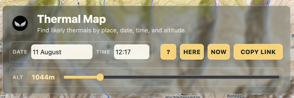
The new overlay gives date, time, and altitude a clear visual structure. On a desktop, everything remains available at a glance. The translucent panel still feels connected to the map underneath, but labels, values, and actions are now much easier to scan.
This is more than a cosmetic update. The controls take up less attention, the attribution and footer sit more naturally on the map, and small loading states make it clear when new thermal data is on its way.
A sharper map at maximum zoom
The refresh also fixes a long-standing quality issue. At the highest zoom level, the map was still displayed at a low resolution—possibly the remains of an earlier technical limitation. The thermal points were there, but the terrain underneath them became blurry just when the finest detail was most useful.
The difference around Bischling is hard to miss:
Before — low-resolution maximum zoom
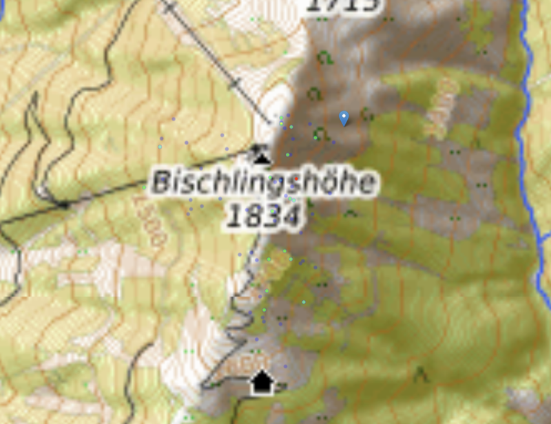
Now — high-resolution maximum zoom

The thermal layer is unchanged, but it is now much easier to relate each point to the terrain around it. That makes maximum zoom genuinely useful for inspecting launch areas, slopes, ridges, and nearby routes.
The difference is clearest on a phone
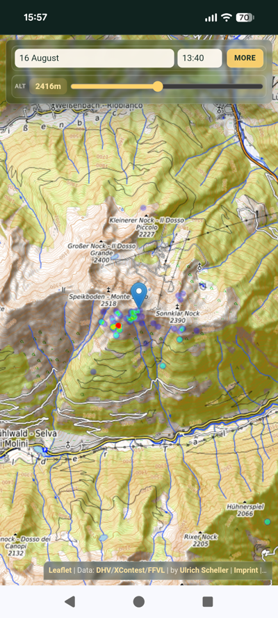
The old mobile layout worked, but it reserved a large part of the screen for controls. On a map, every extra row means less terrain, fewer landmarks, and less context. The refreshed layout keeps the essentials at the top and gives that space back to the map.
Before — old layout

Now — new layout
Useful actions, one tap away
Secondary actions now live in a compact More menu. Here centres the map on your position, Now jumps to the current date and time, and Copy link creates a shareable link to exactly the situation shown on screen. A subtle confirmation lets you know when the link has been copied.
The thermal data has not moved to the background. The interface simply gives it more room to do its job.
Open the Thermal Map and take the new layout for a spin.
Related Posts
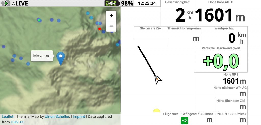
See the Thermal Map while flying
Many pilots asked me if it is possible to use the Thermal Map while flying. And indeed, this was the initial idea of the whole project. But it is hard to debug when you need…
Thermal Map coverage and updates
The Thermal Map has gained traction in the paragliding community. The well-known German blog Lu-Glidz has written an article explaining how to use it. Usage of the website has peaked after the article was published…

German Paragliding XC Champion
Initially, this website was created to present my professional career and ideas around software development. Recently, with my work on paragliding tracklogs and the Thermal Map, it has also become a personal space. This paragliding…